About this Dashboard
The Coronavirus (COVID-19) pandemic has been at the forefront of the global population's concerns over the last year with the consequence having a large impact on individuals daily lives. Twitter is one of the largest social media platforms where people from all over the country (and the world) express their opinions regarding a wide range of topics, and it is of no surprise that there has been a surge of discussion around pandemic and pandemic adjacent topics.
The focus of this analysis is on 'tweet's posted within the United Kingdom with the aim to measure the pulse of general sentiment towards COVID and lockdown over the past year. A multitude of sentiment analysis techniques are applied to the data to measure sentiment change over time.
This dashboard provides insight and visualises the change in language expression over a year. Specifically, exploring reactions to relevant events combined with COVID statistics within the UK. Ultimately, with the aim to make exploration and analysis of our data easily accessible to a nontechnical audience.
The end-user will be able to compare the results of different sentiment techniques and how public opinion compares between countries/regions in relation to the number of deaths, the number of cases, and certain pandemic related news events over the last year.
Please use the sidebar to navigate to the rest of the dashboard!
Have fun! 😊
Data Collected
This dashboard contains two datasets corresponding to COVID and lockdown related Tweets posted within the United Kingdom.
Each dataset contains approximately 300 thousand tweets, starting from the 20 March 2020 to the 25 March 2021.
The keywords used to scrape the COVID dataset include: "coronavirus OR covid OR covid19 OR covid-19"
The keyword used to scrape the lockdown dataset include: "lockdown"
We used SNScrape, an open source wrapper of the Twitter API to collect historical Tweets within the UK containing our key words over the past year.
See Twitter's Developer Policy regarding API and content usage here.
The news events were collected from the Guardian News API
The relevant COVID statistics were collected from the Public Health England
Sentiment Techniques
This dashboard analyses and compares sentiment of tweet content using four sentiment generating techniques:
About the Creator
This was a project to understand (prove a point) about how certain events shifted sentiment (across Twitter) over different geographic and political UK counties during COVID.
Timeline Exploration
Select Tweet Data-set
Select NLP Technique
Total Deaths
Loading...
Total Cases
Loading...
R-Number
Loading...
Current Date
Loading...
Drag the slider to change the date:
Heatmap of sentiment towards COVID-19 in the UK on day:
Sentiment Count Per Day
Top Weekly Emojis
Top News Stories
Top 10 Hashtags
Deaths and Cases Over Time
7 Day Moving Average of Covid Sentiment For Each Country (Starts at 2020-03-27)
Data Analysis and Exploration
Select Tweet Data-set
Select NLP Technique
Notable Days
Select Chart:
Popular Emoji's

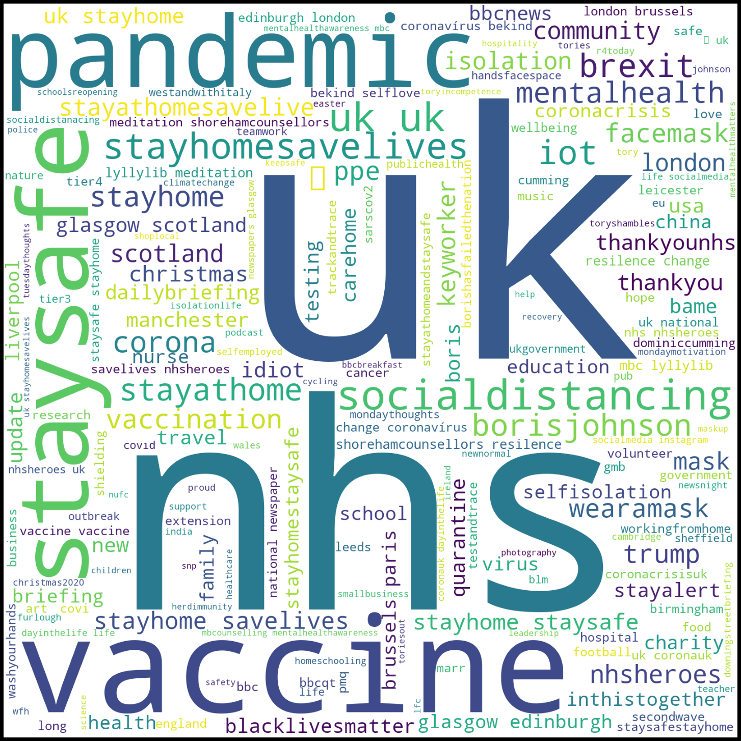
Popular Words (Excluding Keywords)
